Things to Consider When Designing the Logo
Designing the perfect business logo is usually easier said than done. It’s one thing to pick a design that’s attractive and beautiful, and it’s a whole different ball game when it comes to creating a professional business logo. This is because not only your company logo should look unique and attractive, but it should also carry your brand values and vision perfectly.
The following are some of the things that you have to consider when you design a quality company logo:
1. Design Inspiration
Unless you are a professional graphics designer yourself, you are going to need a lot of inspiration to create a high quality and unique logo. There are all kinds of websites and resources on the Internet that can help you with that. However, since it is recommended to study a wide range of designs when it comes to drawing website, you should also explore logo ideas that are not related to your business. This will help you get a broader perspective on the design techniques and help you to come up with completely original logos.
2. Originality
This point is already discussed briefly above but it needs a separate discussion of its own. This is because it’s common for budding entrepreneurs to base their company logos on the popular designs that they find online. For instance, if you run a customer support or communication business, then you may want to use speech bubbles and stick figures in your logo. In the same way, if you run a real estate business, then you may feel inclined towards using an icon that’s based on a Victorian-style house. The reality is that these are rather clichéd concepts and any logo that uses these will quickly become lost among others. So, it’s important that you think out of the box and try to be more creative and original. After all, one of the few things that all brands need is to speak with a business logo, and you can’t speak with distinction and clarity unless you try to create an identity of your own.
3. Relevance
An ideal business logo isn’t the one that’s just attractive and professional, but rather one that’s also relevant to the business and target demographic. For instance, if you sell fashion accessories for small children, then you want a cursive font, bright and cheerful colors, and friendly icons in the logo. In the same way, if you are a software development company, then you are better off sticking with formal fonts and colors (blue works great for IT companies). This is to ensure that the logo appeals to the target demographic with little confusion. After all, a logo is intended for the customers and not the company itself. In other words, the importance of having the right logo can’t be overlooked at any cost.
4. Simplicity
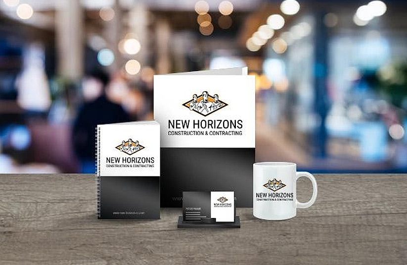
You might be surprised by this, but simplicity is key to making your brand win. So, if you are designing a logo that’s too complex or elaborate, then you are actually headed in the wrong direction. What you really need to do is take a minimalistic approach and create a design that’s simple enough to set in the minds of the target demographic effortlessly. Remember- simple logos can be easily printed on small promotional objects like pens and caps. They can also be replicated on business cards without losing their impact. Plus, simple logos are memorable and stand out among other complicated logos easily.
5. Colors
Colors play an important role in logo design. However, you don’t have to be a professional logo designer to understand color theory. All you have to do is follow a few basic rules that are as follows:
- Avoid using colors that are too bright for the eyes
- Try to use colors that are close to each other on the color wheel. For instance, you can create a warm palette with colors like yellow and orange. In the same way, if you want to create a cool palette, then you can use shades of blue and dark green.
- Make sure that the logo you create looks good both in color and greyscale.
- Don’t use more than 3 colors in a logo.
6. Timelessness
Most of the greatest logos that we know of today are timeless. You can think of brands like Nike and Apple. These logos have stood the test of time, and it’s likely that they will look equally attractive and iconic many decades from now. But why is that? One of the main reasons behind that is that these logos weren’t based on trends. Trends come and go, and if you want a logo to look good for decades, then it’s better to create a design with the future in your mind. If you will create a logo that’s based on a trend that’s popular today, then there is no guarantee that it will look as good as it does today in the future too.
So, there you have it- some of the most basic things that you have to consider when you are designing the perfect logo for your brand. Or else you can reach the web designing companies to create attractive logo for your brand. For instance, web design california. Use this information wisely, and you are sure to come up with something truly remarkable and impactful.


